Custom CSS Border Images
w3schools' tutorialIntro
Borders can be made from images! (though they should be designed with use as borders in mind)
Here is an image I made to be a lace border:

Your source image for your border is split into nine quadrants (3x3):
- the center - usually transparent
- the corners - will remain unaltered
- the four sides - repeated or stretched

After you design the image for your border, all you need is two lines of CSS to give your element a custom border that automatically adjusts to the elements dimensions!
Just like with regular borders, you can adjust the border width (10px compared to 20px above)
The sides the border is on can be specified as well
However, border-radius does not work
Use the following to style your element:
border-image: url(blacklace.png) 17 round;
You can set the width to any size you like, but the color should be transparent
The dimension for the border-image (the "slice") is best at the corners' dimensions (in this example it is 17x17 pixels), but feel free to experiment
- If the corners are a square, you can use one number for the slice, but if it is a rectangle you will want to use two numbers in x y format (horizontal first then vertical, just a space separating the two)
Since my corners are 17x17 anything lower than 17 cuts part of the border off
The larger slices do not appear to have a negative effect, but if the border has transparency and you want the background to end where the border begins there will be space between the background and border (if you want the background behind the border, or your border does not have any transparent parts, feel free to play around with the slice size)
These examples have all had the sides repeat, rather than stretch, so here is a stretched example:
border: 10px solid transparent;
border-image: url("blacklace.png") 17 stretch;
This of course would look better with a source image designed with stretching in mind, as my lace image was not
Backgrounds
By default, the background will span behind the border:
But this can be changed by setting the background-clip to padding-box
Unfortunately, this leads to space between the your border and the background when the slice is greater the corner of the source image's dimensions
To combat this, border-image-outset can be used (while leaving the background-clip to default (border-box))
I set the outset as 4px less than the border width, its not a perfect fix but it helps:
(if the above boxes do not have borders, your browser may not support this property)
Alternatively, a different source image could be used, where the center is filled in, creating a thick dark border where the space would be:


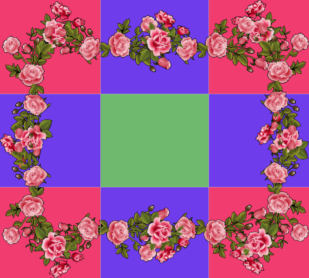
Lets look at a more complex border image
I measured the top left corner to be 326 px wide and 304 px tall, so my css would be:
border-image: url(https://solaria.neocities.org/smallgifs/flowerframe3.png) 326px 304px round;
But if I want a background, its going to look like this:
border-image: url(https://solaria.neocities.org/smallgifs/flowerframe3.png) 326px 304px round;
using the padding box trick we get:
border-image: url(https://solaria.neocities.org/smallgifs/flowerframe3.png) 326px 304px round;
background-clip: padding-box;
There is so much space between the border and the background because of the corner dimensions I chose (I tried not to cut the flowers)
To fix this I use border-image outset
border-image: url(https://solaria.neocities.org/smallgifs/flowerframe3.png) 326px 304px round;
border-image-outset: 20px 10px;
I wanted the background to reach the middle of the border, so I tried half of the border width first (40/2=20). There was a little trial and error to find 10px as the second value, but if your corner is a square you should only need one value
Differing Border Widths

I want to use this image as a border, but the thickness of the top, bottom, and side borders is different for each
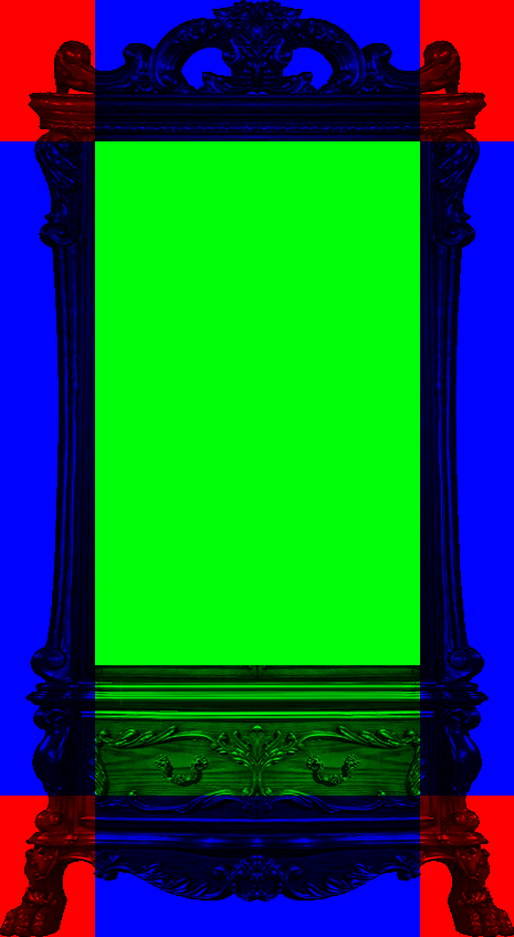
First we need to determine the slice
If we make the slice the size of the top corners, we end up cutting into the bottom border, cutting out some of the bottom drawers
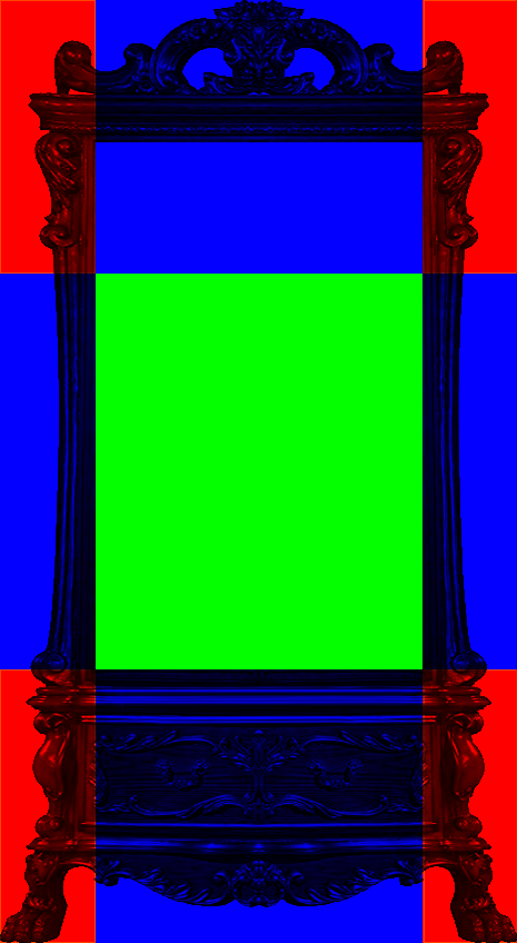
If we make the slice the size of the bottom corners, we have extra space between the content and top border
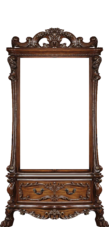
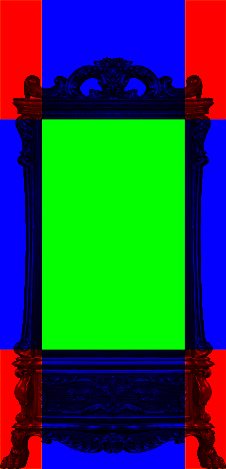
Here I added extra space above the top border so that all the corners are 85px by 245px
notice how squished the borders are; this is because the border width is 30px, making the corners square, where as the slice is very much not a square

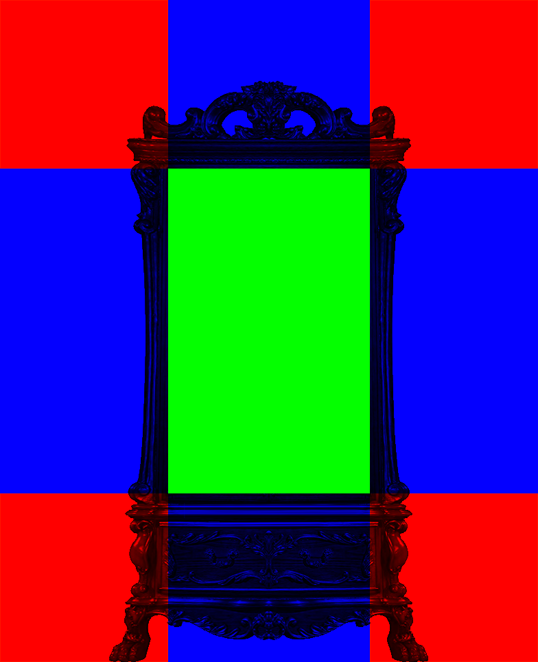
here the slice is a 245px square, allowing the borders to be proportional to one another
here i made the border width 50px instead of 30px since it was a little thin
now the only problem we have here is the extra space outside of the sides and top; this can be fixed by using negative margins on these
Extra Bits
The border image can also fill inside the border:
border: 10px solid transparent;
border-image: url("blacklace.png") 0% round;
border-image slice: fill;
0%
5%
10%
15%
20%
25%
30%
35%
My Border Images
Lace Borders
My lace border images - feel free to use: (credit on your page would be appreciated but not required <:3)


higher res lace borders: (with mesh center for larger slice values)







compare the orginal with a thick border
to the higher res lace image
which of course would also work for thin borders too
slice: 29
slice: 30
slice: 31
slice: 32
slice: 33
slice: 34
slice: 35
slice: 36
slice: 37
slice: 38
slice: 39
Rainbow borders


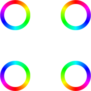
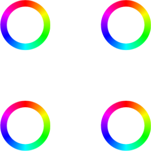
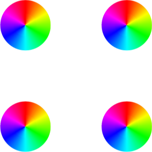
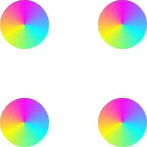
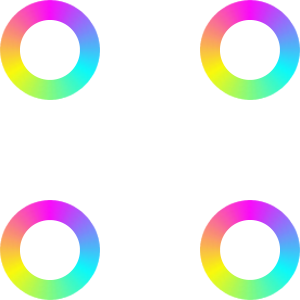

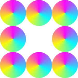
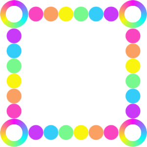

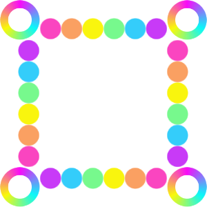
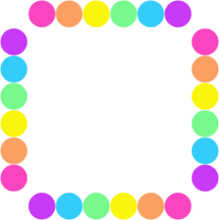
use stretch on the solid borders
and since they are solid with no transparency, you don't need to worry about space between the border and the background
round vs stretch does not matter for the ones with only corners