Dropdowns
Text Box
position: relative;}
.child {
display: none;
position: absolute;}
.parent:hover .child {
display: block;}
The basic formatting for adding drop down text to an element
.parent is what the user hovers over, and .child is what shows up
position and display are the important properties here
further styling can be added to the last selector to make the drop down text have a background/border/etc
note that the child element needs to be a child (ex. within the parent element)
Box Shadow
box-shadow: 0px 4px 8px 0px pink;
this creates the shadow around the border of a dropdown element
- the effects are in the order of:
- x position of the shadow (to right, negative for left)
- y position of the shadow (bottom, negative for top)
- shadow blur (0 = no blur, higher = more blur)
- shadow spread (higher = wider radius, can be negative for lighter shadow)
- color
Alignment
standard dropdown contents are aligned to the left of their parent element and below it, however they can be aligned to the right and above the parent element
Right
.parent:hover .child { right: 0;}
Above
.parent:hover .child { bottom: 32px;}
i chose 32px as the distance because it is twice the height of the standard text height
Menu
similar to text, but the links are styled as well
.child a { display: block;}
this is the added selector
the link element can be styled further, and its hover can be styled as well
Images
Images can be put as both the parent element and the child element for dropdowns
note: i removed the .ex container, so i had to style the .parent container with display: inline-block so that the dropdown would only show when over the image (rather than when hovering over the entire line)
Image Gallery
Basic Gallery
for this simple gallery, only one selector needs to be made

.gallery img {
float: left;
margin: 1%;
width: 23%;
height: auto;}
percentages were used so that the same number of columns would exist regardless of screen size
How to calculate the width of images:
image width = (100 - 2mc)/csimplified from: (100 - (2m + 2m(c-1)))/c
where m = margin and c = columns (# of images desired in one row)
Clickable Images
put the image element inside of a link to the same image
< a target="_blank" href="image.png">< img src="image.png">< /a>
this will make it so that when the user clicks on one of the images in the gallery, a full version of that image will open in a new tab
Basic (with different images)
gallery with images of different sizes


Set Height
gallery with images of different sizes, and a set height
.gallery img {
float: left;
margin: 1vw;
width: 13vw;
height: 13vw;}
using viewport units (vw) allows the images to be square
height percentage is based on the height of the parent element, so height =/= width even when they have the same percentage
pixels could have also been used, but allows for adjustment to screen size
Cropped Images
this gallery is much like the one above, but it crops the images rather than stretching them
.gallery img {
float: left;
margin: 1vw;
width: 13vw;
height: 13vw;
object-fit: cover;}
the cropping is done by object-fit: cover;
Smaller Images
just a small gallery for fun
Responsive Gallery
here the number of columns will change depending on the width of the viewers screen
@media only screen and (max-width: 800px) {
.gallery5 img { width: 18vw;
height: 18vw;}}
the use of @media allows the width of the images to be specified for different screen widths
in this case there are five images per row until 1000px where it is 4 images, 800px with 3 images, 650px with 2 images, and 550px with 1 image
(multiple @media selectors were used)
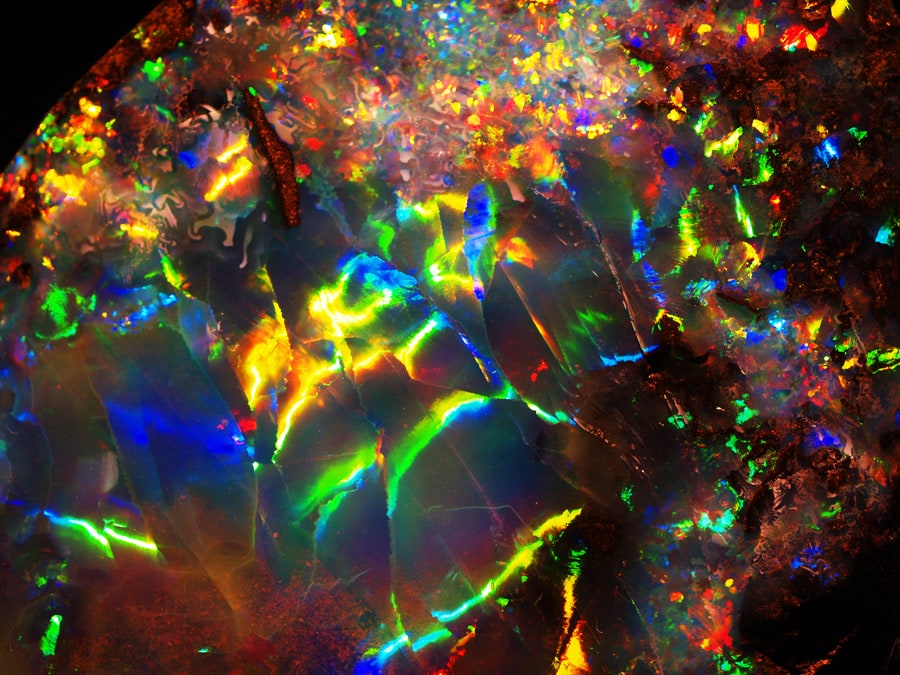
Image Sprites
A sprite image is a single image containing multiple images (think a pixel sprite sheet for video games)
this is done to preserve loading time by reducing the amount of images the server has to access
on websites sprite sheets are often used for navigation icons
#sprite1 {
width: 47px;
height: 63px;
background: url(asgoresheet.png) -4px -4px;}
< img id="sprite1" src="clear.png">
the individual image desired is identified with an id, its dimensions are specified, and the sprite image is given as the background
in the background property, top left coordinates are specified; notice how they are negative
in the html webpage, the image is shown by using the id
the src attribute is not necessarily needed, however a clear image is used, because otherwise an indented border will be on the "background"