You can use the CSS property border-image to give a custom border to any element, without having to put it in an additional container. (Updated: May 2025)
Basics
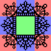
Here is a small lace image I made to be a border image:
border: 20px solid transparent;
border-image: url('lace.png') 17 round;
You will need two lines of code, first a normal border with a thick width and transparent color. This just defines how wide your border will be, and makes it transparent so that the border image can show through. The second line is the actual border image.
The image you use will be split up into nine sections: the four corners, the four sides, and the center.
corners - will remain unaltered
sides - will be repeated or stretched
center - will be cut out
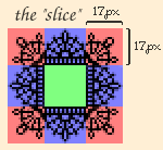
Lets look again at the border-image code:
border-image: url('lace.png') 17 round;
first the url of the image is given (make sure it is in quotes)
the number is the slice, this is the dimensions of the corners in pixels (do not include units)
a single number means your corners are squares with that width and height, which you will probably want your corners to be (otherwise your border may get squished)
my lace border corners are 17 by 17 pixels
round means that the sides of the image will be repeated in order to span the length and width of the element
use stretch for the sides to stretch across the length/width instead of repeating
Again, the slice is just the corner dimensions of the border image!
The number just tells the CSS what to consider the corner, you can make it smaller or bigger than the actual corner, but your border may not look right.
Whether you use round or stretch depends on the image.
This paragraph uses a lace border image with the round value.
This paragraph uses a lace border image with the stretch value.
Rainbow border image with round.
Rainbow border image with stretch.
As you can see, repeating the sides looks better for the lace border, but stretching the sides looks better for the rainbow border. Notice how the corners are unaffected in the stretched lace example.
You can adjust the border width, and which sides have borders, but you can't use border-radius with border-image.
Background
If you give your element a background you may notice that your border image overlaps it like so:
Example of the background showing behind the border.
To fix this add background-clip: padding-box; to your element with the border image:
The background stops at the border instead of going behind.
You can also use border-image-outset and make it equal to the slice (17px in this example):
The background stops at the border instead of going behind.
Notice the difference between the two methods, background-clip: padding-box; cuts off the background and leaves the border where it was, where as border-image-outset: 17px; keeps the height and width of the background, shifting the border out instead.
The background won't show through a solid image border, so no work arounds are needed.
Normally our border image's center is cut out, but we can fill it in, allowing it to act as the background.
border-image-slice: fill;
Consider this larger lace border image with a mesh center.
Here the corners are 34px wide and tall, so adding border-image-slice: 34 fill; fills in the background with the center of the border image.
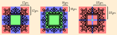
Slice
Lets look at what happens when we use a slice value that is not the same as the corner of our border image.
For reference here is our border image when the slice is the same dimensions as the corner of the image (border-image: url('blacklace.png') 17 round;).
The border gets cut off when the slice is less than the corner (border-image: url('blacklace.png') 10 round;).
There is extra space between the contents and the border when the slice is larger than the corner (border-image: url('blacklace.png') 25 round;).
The red in this diagram represents the slice we chose for each example above. Notice how the 10px slice does not cover enough of the corner, leaving some of the border to be cut out (the green). On the other hand the 25px slice covers too much of the border, including the blank space in the center. Infact it is so large that there is barely any border left for the sides (blue), which is why the border in the last example is so dense, that narrow blue section was the only part left to repeat.
Making an Image into a Border
Hand drawing is one option, like my small lace borders, but you can also search "[example] border png" to find some borders you can use as border images! You may have to edit them so they are more suitable.
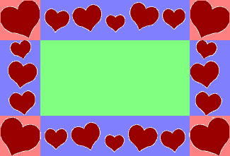
Consider this tacky heart border:
The sides have some repeating patterns, which will be unecessary to include in the source image since we can use round to repeat the sides. I cut those out (and added bad transparency) to make:
Now we have to determine the slice to use.
We want the corner to be a square, and luckily I was able to get a square without cutting off the corner hearts, nor cutting into the side hearts. The corners are 57 pixels wide and tall.
border: 20px solid transparent;
border-image: url('heartborder.png') 57 round;
If your source image only has corners, no sides, your border-image will also only have corners, which may open up some interesting designs.
It doesn't matter if you use stretch or round since there are no sides.
Similarly, a border-image can have sides and no corners. Just make sure the slice you use is large enough for the width of the sides.
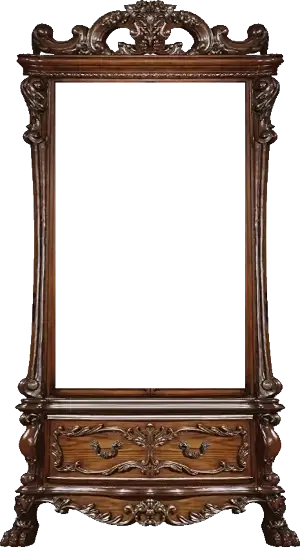
Lets look at a more complex example.
I chose this curio cabinet and made it into a border by using the transform/perspective tools, mirroring, and cutting out the center.
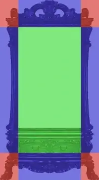
So now lets figure out the slice. I'm going to try the upper corners first.
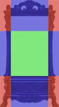
They're rectangles which is already unideal, but the worst part is that the bottom drawers will get cut out by the green center. So what if we use the bottom corners as the slice instead?
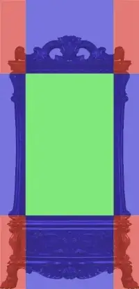
Unfortunately now our top border will include empty space below it. To keep the corners the same size, yet not cut anything off, I'll add space above the image.
This is better, but the top and bottom borders look a lot more squished than the side borders. Of course they are thicker in the original image, but since our border is 40px all around, they get unequally squished.
Here I've included more space in the image so the the slice is a square. To compensate for the extra space within the border image, I'll have to make the main border thicker and give this container negative margins.
Calculating negative margins
You can do trial and error to figure out the negative margins you need to get rid of the excess blank space, but you can calculate them too!
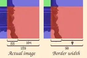
Here I'm going to calculate my side margins. The width of my slice in this image is 159px, which includes the excess space. I need to figure out how wide my excess space is, in order to counteract it. I know that the width of the cabinet side was 55px before I added the extra space, which means that the extra space is 104px (159 - 55).
But we can't use -104px as our side margins!
Our border is 90px wide in this example (border: 90px solid transparent), so now we have to figure out how much of 90px is empty space.
First we are going to take our empty space and divide it by the total width of the slice: 104px / 159px = 0.654.
Now multiply the border width by that decimal: 90px * 0.654 = 58.87px
I'm going to round that down to 58px so that nothing overlaps, thus my side margins are going to be -58px!
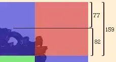
Our bottom border does not have any extra space, but our top one does, and its not the same as the side borders.
We are going to do the same thing and divide the empty space by the total width: 77 / 159 = 0.484
Then we will again multiply 90px by the decimal: 90 * 0.484 = 43.58. Thus our top margin will be -43px!
Free Lace Borders
Just some border images free for you to use ♥ credit is appreciated but not necessary. Feel free to edit them into any color you want! Use 34 for the slice.
This guide was one of my very first! I hope now it is a little clearer than it was before ^^