Baby's First Page to Now!
Character Carrd
2019Ever since I discovered carrds I've loved making them! They were so fun to design. Most people use them to dislpay links to their social medias or to display DNIs/BYFs and abouts, but they can function just like a mini website! I used my Carrd to share information about my orginal characters and their world. They do limit the amount of elements you can use however, and now that I can use HTML/CSS and have a Neocities, I dont have use for Carrd anymore. My story has changed from the Carrd shown here and I've since made a page for them! My current character page.
First Personal Page
12/28/21
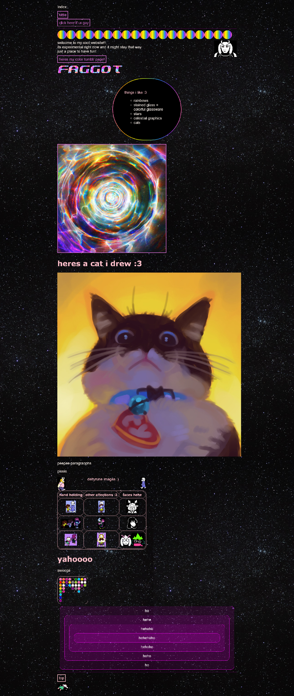
While first learning HTML, before I made my more serious note pages, I made a page with my little experiments. Considering how fleshed out my site is now, I thought it would be cute to see my very first attempt at a personal webpage ^^ It was never published, nor did I intend for it to be.
Select the image or this link for the full HTML of my first personal page!
As you can tell, I still enjoy starry backgrounds and rainbow CSS designs!
The rainbow border around the likes list was done by making a div with a rainbow gradient background, giving it a padding of 2px, and putting another div in it with a black background. I was very excited to be able to make rainbow borders, and that is still how I go about making them (though now I would use a conic gradient rather than linear)!
I found out you could layer divs with transparent colors to increase the layered opacity, inspiring the head divider on my homepage!
I did have one html webpage before this one, I was not setting out to learn html, it was a basic computer class i took for my chemistry degree. I didnt know anything about how html or webpages worked, i simply copy and pasted code from online. I really wish I could show it here, but I can't find it :( I seemed to be the only person of the class who had fun working on it, considering no one else appeared to put much time into their pages, while I readily spent my free time styling mine. Naturally I gave my page a starry background and a rainbow title ^^ (done by making each letter a different color lol).
CSS Notes
The biggest visual inspiration for my neocities site came from my CSS note page on Margins & Padding!
Each of my html and css notepages were styled differently, and I had a lot of fun making this one celestial themed!
As you can see its very similar to my homepage, down to the font, borders, background, and most notably, the layered purple header divider that turns gold on hover.
The header was done by nesting purple divs with transparency inside of each other, allowing the purple to stack. The border was styled so that it was round and had double gold lines, intended to evoke cresent moons. Upon hover each div changes to yellow, allowing for a gradual glow effect as the user mouses towards the very center.
It appears the main changes I made were adjusting the purple accent color (making it warmer) and adding more complexities, such as the text shadows and sidebars.
Early Neocities
Here is the earliest WayBack Machine caputure of my homepage from June 30, 2022, just a few months after I made it! Its so simple compared to now. There arent any earlier captures, but at one point my site only had one sidebar (my link page reflects this).