The Primary Colors of Pigment and Light
Important update: These pages have moved to their own domain at https://rainbowspec.observer, where their information, organization, and graphics have been significantly improved! This page is replaced by my new primary colors page.
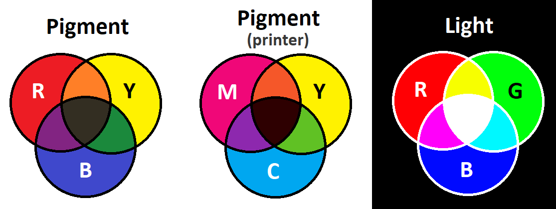
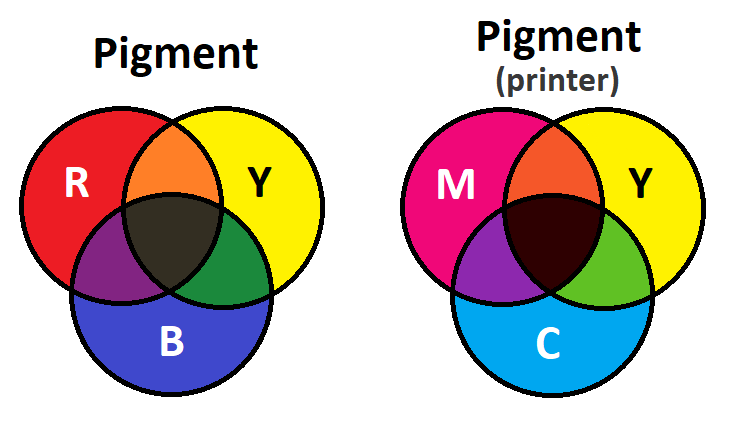
Pigment Primary Colors
Contrary to popular belief, primary colors cannot make every single other color, just a wide range that covers many colors. The range is quite impressive for only three colors, but primaries do miss pigments. If you've mixed yellow and blue paint in school, trying to make green, you likely noticed that you could only get a dull dark green. You can get a better result with yellow and cyan, but a green pigment itself will be more vibrant.
Pigments and dyes follow the subtractive color model, which means at each additional pigment, the darker the resultant color gets. Ideally an equal mix of primary colors will create black. The more transparent the material is, the truer to reality this is. For that reason, transparent dyes can approximate black better than opaque pigments.
While RYB is considered the primary colors for paint, printers use a different set: CMYK: cyan, magenta, yellow (and black). Black is used for two reasons: CMY ink does not mix to a perfect deep black, and black ink is much cheeper than layers of colored ink. Artists could also use CMY if they so desired.
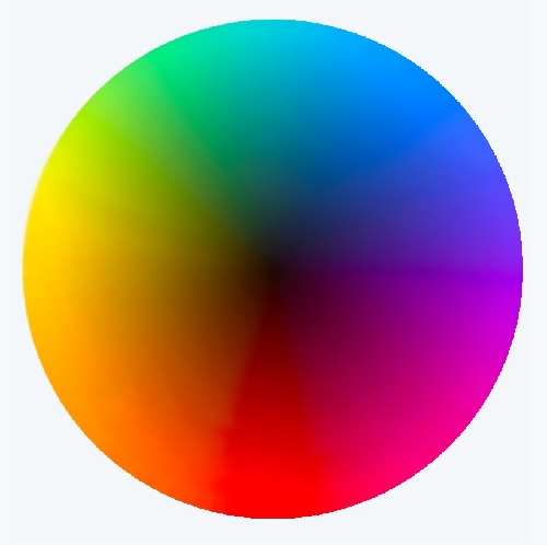
Imagine that this circle of color represents all saturated pigments (the edge) and their resulting mixtures (the inside).
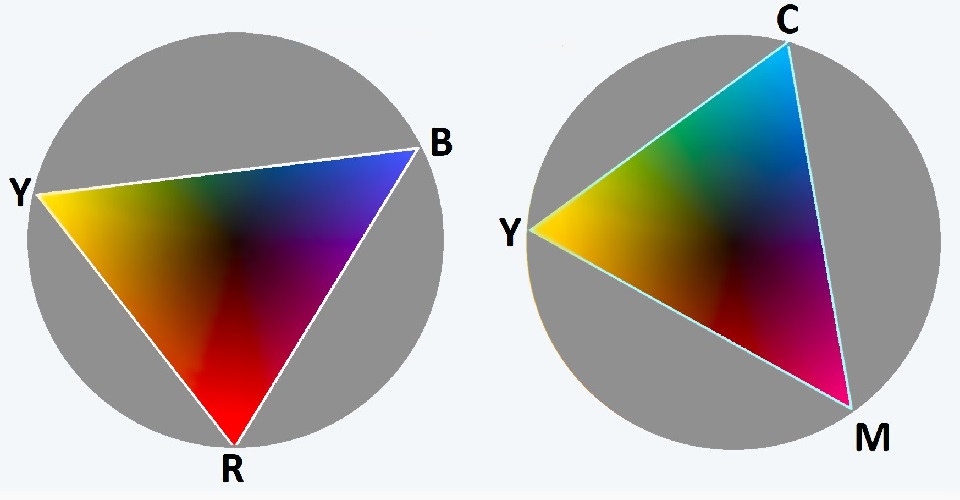
Here are two different primary sets often used for pigments: RYB (first circle) and CMY (second circle). The points represent the primary colors, the colors within the triangle are those the primaries can make, and the colors outside of the triangle cannot be made by the primaries. Both RYB and CMY have their weaknesses, with RYB lacking saturated purples and greens, and CMY lacking saturated red. Note that this diagram is just illustrative; it does not caputure the effect perfectly. Usually both red and magenta when mixed with yellow can make a good orange, but orange is dull in these triangles. If I were to make the diagram again, I would shift the saturated colors so that yellow, red, and magenta are closer.
Artists of course have a much larger variety of pigments available to them than just three, so a larger range of colors can be made. Five colors covers a signifigant more area of the circle than three, however the more primaries you add, the less notable the difference becomes. Perfect equilateral shapes will also cover more area of the circle than oblong ones. Picking colors an equal distance away from each other on the circle will make better primaries.
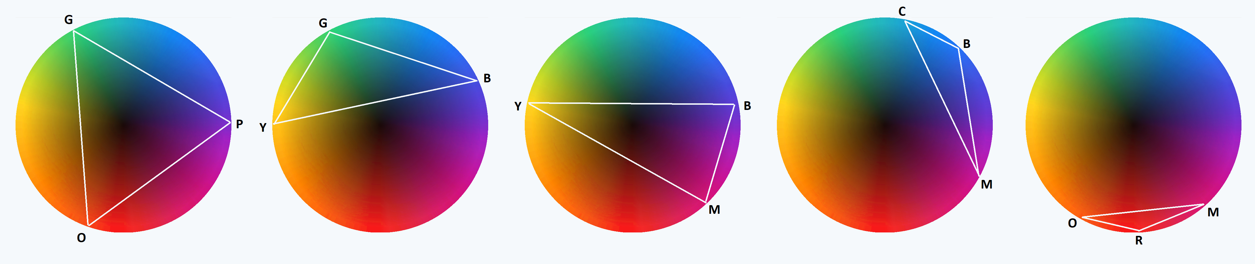
Theoretically you could make a primary set out of any three (or more) colors, depending on what range of colors you want to prioritize. The closer they are, however, the smaller your range will be.
Light Primary Colors
Like how red, yellow and blue are considered the "primary" colors for pigment in traditional media, red, green, and blue (RGB), are used as the primary colors for digital screens. Just like the traditional primary colors cannot make every pigment in nature, RGB does not cover every saturated color of light. This is particularly noticeable with teal.
Notice how the cyan, magenta, and yellow colors on this RGB wheel are all lighter than the other colors. That is because, as a mix of the primaries, they are not represented by their own wavelength, but a mixture of two, making them lighter than their fully saturated single wavelength counterparts. The cyan here would actually be more of a deep teal color if it weren't a mixture.
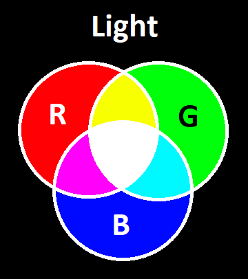
Unlike pigments, colors of light follow the additive color model, meaning the more wavelengths blended together, the lighter the color is. An even mix of wavelengths should make white light. The absence of light results in black.
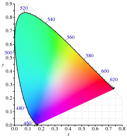
This diagram is from this wikipedia page on spectral color
This diagram illustrates the wavelegths of light (the rounded outter rim) and how they mix (the inside and flat side) to make every visbile color of light. Since magenta and warm purples do not have their own wavelength they are represented by a flat line between red and violet.
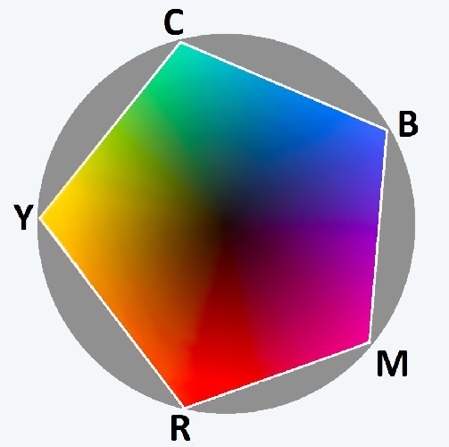
Keep in mind that these diagrams are displayed on a digital screen which uses an RGB display, thus the we can only see colors within the triangle shown in the next diagram. The colors shown outside of the triangle in this diagram are not accurate due to the limits of our screens. In reality the large turquoise space outside of the triangle is much more vibrant teal color (notice how close the cyan on the triangle is to white, espacially compared to yellow and magenta).
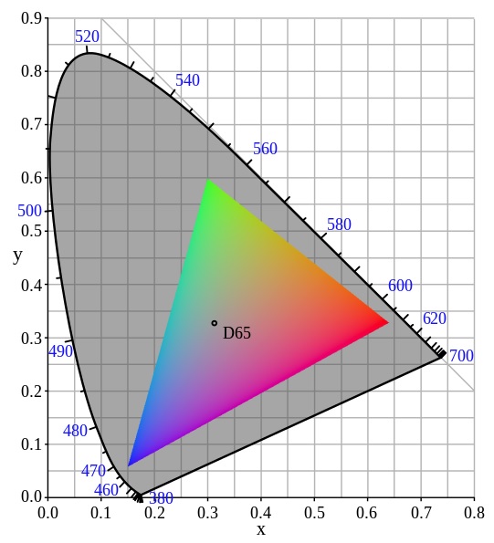
Here is the triangle made by standard RGB colors (sRGB). The colors outside of the triangle are colors the RGB primaries cannot make. Notice how on the triangle's edge magenta, cyan, and yellow are closer to the white center than the primaries are, showing why they are lighter.
Unlike pigments, any colors other than RBG would be impractical as primary colors, due to the fact that the visible spectrum is a line rather than a circle (warm purples and magenta don't have pure wavelengths), meaning one primary should be on one end (blue/violet), one should be on the other (red), and one should be in the middle (green).
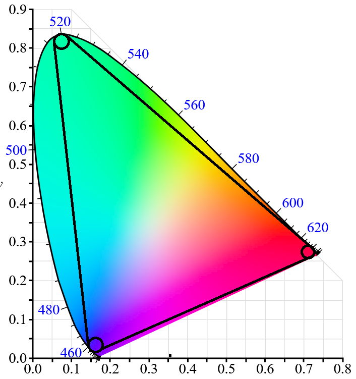
Now the exact wavelengths chosen to represent RGB can (and do) vary, but I think they could be better, particularly green. Notice how the green primary in the sRGB diagram is near 555 nm, but the peak of the arc is near 520 nm. On the second diagram I put what I think would be more ideal primary colors for RGB, so that they cover more area of the visible colors of light.